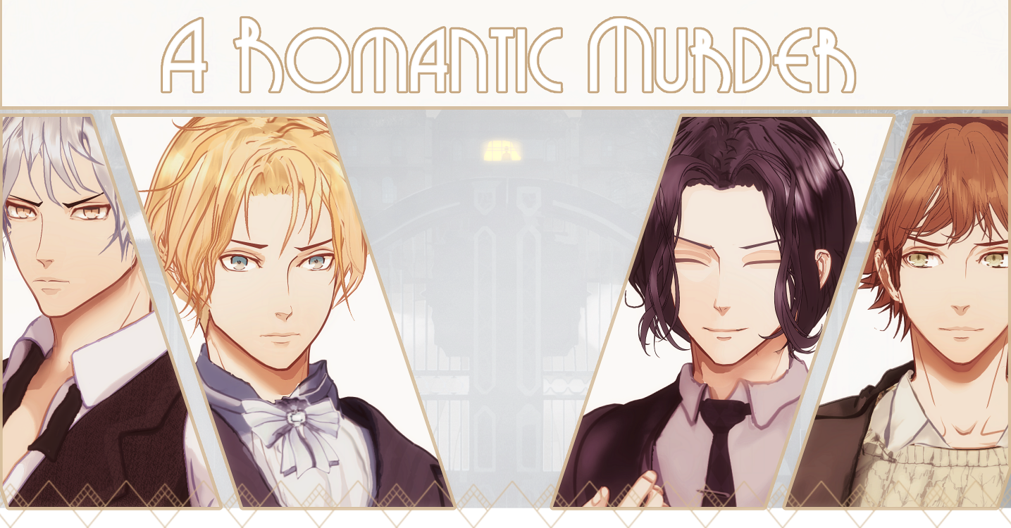
A Romantic Murder (Demo)
A Romantic Murder - Otome Jam Recap 2 - Suits and more Suits
This is the second of three short dev blogs I'll be doing as a retrospective of my experience creating the demo of my Ace Attorney-inspired murder mystery for the Otome Game Jam in 2023.
Part Two: Character Sprites and Writing
All right, now for the fun part! Having spent the time prior to the jam, as mentioned in part 1, refusing to make any assets while collecting inspiration and reference material, I was ready to spring into action on that first day. The first step was to decide on the best order to do things in.
In the end, for this first month I went with:
- Writing (for 12 days)
- Character Art (for 14-16 days)
- Character expressions and sprite code (rest of the month)
So there were a few different reasons I went with this plan of things, and I imagine someone else might have chosen differently. The main reason is that I thought that doing the script first would help when it came time to draw the characters, which it did. Also, since Shar had been kind enough to join me as an editor by this point, I wanted to give them the most leeway possible when editing since one of my main goals for this game was to make sure it wasn't a huge stressful rush.
...which was only partially successful, of course, but still better than it could have been!
Writing
In any case, I started with writing. I discussed in the prior section that I was wildly off in my estimates, guessing that I'd hit around 10K words per day when in the end it came down to more like 4K. Because of my full-time job. That I totally forgot about. Sorry, job!
My fallback plan was to get the common route done so all the characters would be introduced, then work on the first sections of as many routes as I could get to. I figured that that would make sure that the demo gave at least a fun playing experience and a chance for people to see what the final game would be like.
Back in the planning phase, I'd done preliminary block-ins of the characters, seen below. These I did quickly by just making one base head for men and one for women and just adding colours and modifying features until I felt like I had a clear-ish idea of what the character would look like. I find the fastest way to do this is to use the symmetry tool to block in and then just start pushing things around, though it's also useful to choose a color for each one and make sure nobody has the same hair or eye color among the same gender as a quick hack to keep them looking individual.
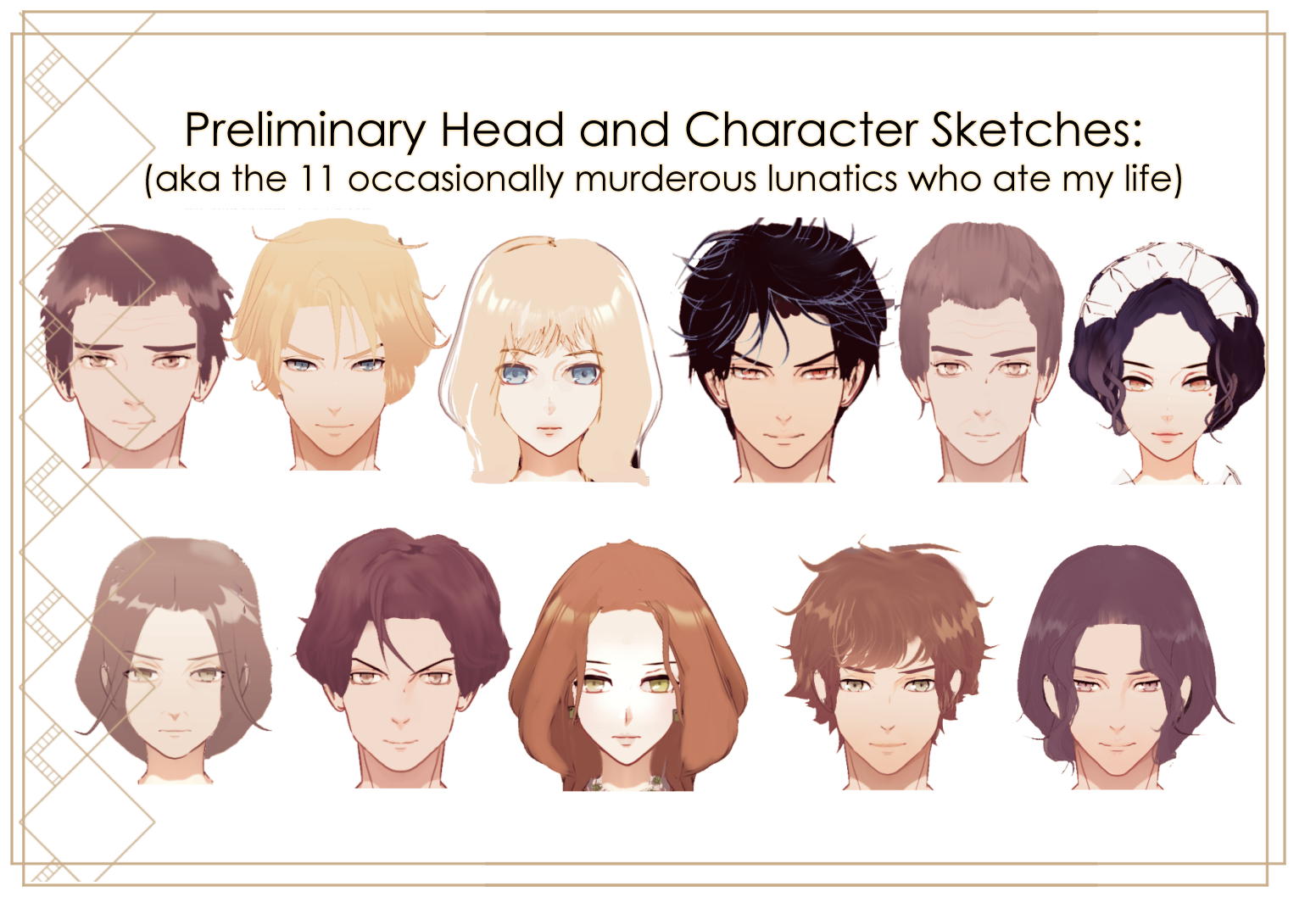
Most of them would change a fair bit between this and the final version, but they were still helpful to have before I started writing because it meant both that I could picture them in any descriptions I needed to do and that I'd spent enough time thinking about their personalities that the images could be a quick check for me during the process. E.g., if I couldn't picture that head saying what I was making them say in the script, probably one or both needed to be adjusted.
Writing the common route was surprisingly fun! I planned out all the scenes on the first day since I had a clear idea of what I needed to establish as a base for all the routes, though when I started actually writing it things changed a little. The intro bit with the driver was never planned, but I ended up liking the somewhat classical foreboding of it too much to cut it, and I hadn't planned for the elder Haverly's to be quite the comic duo they turned out to be. Also, the MC turned out to be very different than I was originally planning her to be - more on that later when we deal with the art.
I finished the common route about day four, and by then it was clear to me that I probably wouldn't be able to get much more than 3-4k of writing done per day. I couldn't afford to allocate more time to the writing, so I reordered my plans to try and hit more interesting story beats earlier on and moved James' route up the priority list because his murder investigation is one of the earlier ones and I wanted to give people the chance to try out the investigation mechanics.
I won't go into too much detail on the rest of the writing since I know everyone has their own process and I imagine mine wouldn't be that useful to anyone else... unless they like spreadsheets 😁. I will say that I made the choice to type it all directly into Notepad++ in renpy pseudocode with a little file open on the side where I could write down the sprites and backgrounds I was going to need to make coding easier later on, which it did. I didn't want to use a fancier IDE because code hinting and such would slow down the writing, and this was intended to be mainly a non-functional rough version of the code in any case.
This is also about where I began to realize that my plan to reduce the number of sprites and background was doomed to failure. Cutting the number of sprites to just those relevant to the murders I would be able to get to would take all the fun out of guessing, and even with just the common route, there were around eleven backgrounds that I'd need to have for the scenes that I had planned. I could have reduced the number of backgrounds by taking people to the same places more often, but I also needed to establish those places for later murders and give the sense of this expansive mansion with this relatively small bunch of weirdos running around inside of it. So at this point I also started thinking about ways to speed up making the backgrounds later.
Character Art
Once I had the scripts written and they were off being improved by Shar, it was time to turn to the sprites. And this was both incredibly fun and way more stressful than I'd expected. What made it fun is that I chose to set this in the 1930s to pay homage to my favourite genre of mysteries, which meant I got to spend a lot of time sketching out fancy gowns and looking at well-dressed people. Below are some of the things I was looking at, though there were hundreds more that I can't repost here for licensing reasons.
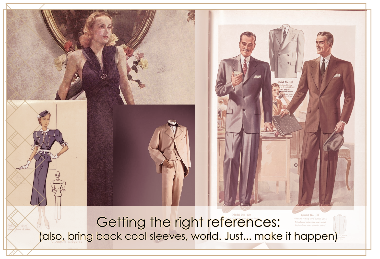
In general, the 1930s had moved away from the unstructured dresses of the 1920s for women, with more accents at the waist and just a thousand ways to highlight the shoulders. Puffy sleeves, ruffles, capes, bows, stitching, you name it. Men, on the other hand, wore... suits. This would become a bit of a problem for me later on.
I did all the women in the cast first, visible in the image below:
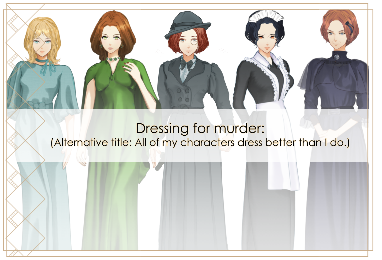
In general, it was the same concept as the head design - everyone gets their own color, nobody's outfit should look too similar to any other, and ideally they should say something about the character itself. Here's some of my notes on the sprites and outfits from left to right.
- Celia: I did her first and it kind of shows. But I still love how her sleeves came out and her little choker, and she looks much less like a deranged Alice in Wonderland than she did in the original sketch, so I'll take it.
- Fia: One of my favourite outfits because I love the shiny fabric. The cape was a last-minute addition because the 1930s were all about the shoulder and I wanted to give a nod to that while still showing more skin. Curly hair was also big in this period, but I didn't want to give them all perms so she has more of a Hollywood version while still having some curl. Jewellery from the kind people who make assets for Clip Studio.
- MC: I did her last, and she changed many, many times. Originally she had brown hair and a kind of sunny colour scheme, but I couldn't do it after I started writing her - there was just too much nonsense going on in that house for her to be constantly smiling. You never get to see her below chest level in the demo, so I'm still not sure if I'm actually going with that skirt - I may give her a shorter version with a flare since she needs to run around so much.
- Sophie: Ah, Sophie. It's hard to make an attractive maid in this time period - 1930s maid outfits mostly look like someone distilled sadness into a dress and then put a wrinkled frill on it. In the end I had to give her what I consider to be the prettiest eyes and hair and hope for the best. She also continues to have my favorite nose, and I don't know why I didn't draw them all like that.
- Mrs Haverly: She's the only wearing something approaching mourning garb, but I still gave her some shoulder and waist emphasis to keep her in line with the others. I ended up loving how the tulle came out, so now I wish I could have put them all in tulle, including the men. Her face and hair changed the most from the original draft among the women, both because I wanted to give her more visible ties to her son and to make her look more distinct from the rest of the female cast.
And now to the really stressful bit - the men. Which took me by surprise, because I usually find men the easiest to do since I've drawn more of them over the years... but man, suits were a thing back then. Suits everywhere. And I love how men look in suits, but I did not love the way they all started to look the same in my first draft. I have pages of suit sketches, and I couldn't tell you who they were originally supposed to be for the life of me.
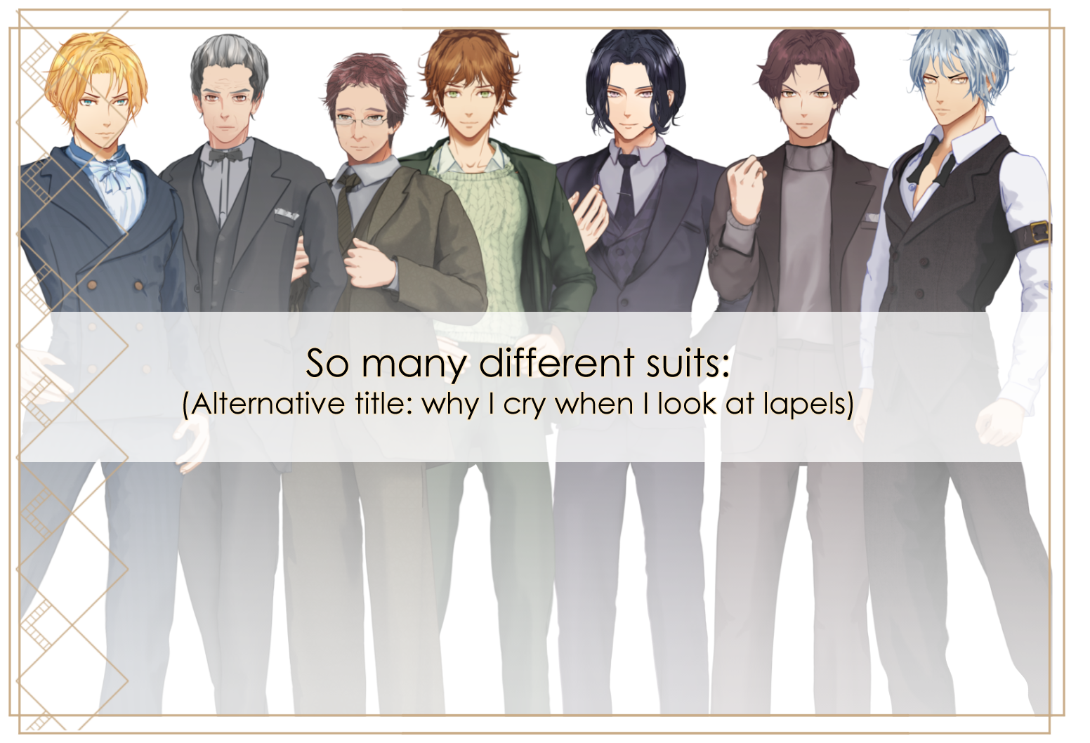
In the end, I cheated madly to try to give them all a distinctive look. Here's how!
- James: He got the only striped suit, and the only fluffy ascot. His suit is aggressively double breasted with brass buttons, as befits his status as a viscount and my desire to give someone brass buttons. His face changed a fair bit from the draft, since he was originally supposed to be a smirky charmer but the MC was having None Of It. Fun fact: I originally had him tilted 30 degrees to the left, thrusting his hip out like some kind of Elvis impersonator, but the second I put him next to another character, I couldn't stand it. Stand up straight, James!
- Mr Thompson: He got a morning coat, since he's older and it's a very formal option. They are... so hard to draw, people. Like someone cut a bell in half or deformed a penguin. Also, it was weirdly flattering on him so I kept having to make his hair stranger and add more wrinkles to counterbalance that since I didn't want him to steal focus.
- Mr Haverly: He's wearing a sack suit, an unstructured suit which would have been popular a few decades before the time of the game - thin lapels, normal human shoulders, no waist definition, unruly tie. He doesn't strike me as much of a shopper, so I thought I could get away with it. His face also went through a fair number of revisions because I wanted to give him more common features with his son.
- Adrian: Bless Adrian for not wearing a full suit, but curse him for the sweater, which was unexpectedly hard to draw consistently even though I was just using a texture brush with some shading on top. I still like his look, though - he didn't always have bangs, but I added them because without them he looked oddly like Junpei Niina from Tokimeki Memorial Girl's Side 3.
- Blake: I gave him a single-breasted suit but a double-breasted harlequin-patterned waistcoat and the most formal of all the lapel types for plot reasons that I cannot go into here. I also had to revise him multiple times to make him look less sinister than his draft or he would have been arrested in all the routes whether he did it or not. Also, why did I make so many of their hands visible? Rookie mistake, past me.
- Crispian: I wanted him to look attractive enough to be with Fia and related to James, but weaselly enough not be confused for a love interest. Therefore, the ridiculous hair cut, mousey colour scheme, and the improperly worn suit complete with the classic après-ski jerk sweater and unpleasantly casual dark lapels. Mind you, I don't know if any of that comes through in the outfit or I'm just projecting it from my own strong feelings after writing him.
- Nick: I love Nick not for his personality, which is terrible, but for being the only one of them not wearing a suit jacket. As a gift for that, he got nice trim on his waistcoast and fancy little buttons that you can't really see. His face had the most drastic changes from the initial draft - he was initially supposed to be dark haired with the classic star bangs and unflinching gaze you see in anime protagonists, but his character went a different way during the writing. I tweaked things until I was happy with it, so now you've got a pouty elf opening the front door of this murder mansion. So it goes during game jams.
I didn't have much time per sprite, though in practice I spent more time on the LIs and MC and less on the side characters, so I came up with a few ways to make life easier. My main tricks for the clothes and bodies were using the useful figures available in Clip Studio as a base guide for angles (though the hands were less useful than I'd hoped since otome characters all have hands like stick insects) and then using gradient maps to let me draw smudgy things and have them read as more or less flat shading for multiply or overlay layers over the base colors, which let me keep things to two or three colors even though my actual drawings were quite haphazard due to the time.
For the faces, I made a macro that created a clean set of folders and layers that I could reuse for each with layer names like 'eye white shading' 'face gradient' 'mouth shading' 'hair lines' 'hair shading' 'hair highlights', etc. That made sure I could just go through and fill each layer in quickly and wind up with results that looked similar. After the first one I did, I also always had the last sprite I worked on hanging around on the far left next to the new one so I could crosscheck between them as I went. This often led to me going back to make changes to earlier ones when I found some style element I liked better, but overall I think worked well to keep things consistent.
Also, I made the unusual-for-me choice of not being afraid to use some pre-made textures and brushes instead of insisting on drawing everything myself to make it match; line weights were a problem for post-jam Kay to deal with, and adding some texture element to each helped them look more finished. I did similar things for the hair, though there I also made my own brushes to speed things up so I could draw lines and shading at the same time and just copy them over. Finally, I harvested madly from the things I'd already done - if I liked a wrinkle from Celia's dress? Bam, now Fia had it too, and so on.
I could probably write on this topic forever, but for the sake of brevity(?) I'll move on to the last part of what I got done this month.
Sprite expressions and coding
This is the section that may be most useful to anyone else making a visual novel, since most of you will likely not set yours in the 1930s or have to think quite as much as I did about suits. But anyone who wants to make a visual novel must at some point come to terms with adding sprites and changing their expressions, so here's my process:
I decided to use the LayeredImageProxy system, as I find it's the most flexible. This essentially lets you take a faceless base, which is really a super creepy-looking image, and apply different combinations of eyes, mouth, brows, and anything else you like to appear on top of that as a result of your defined expressions. I originally planned to only make the expressions I needed for each character, but then I realized it'd be easier in some ways just to make the same layers for each sprite even if that expression wouldn't be used in the story so far.
That's because I could automate this process in two ways:
- If I organized the layers into the same names and number patterns for each, I could save the file as PSD format, open it in Krita, and use the amazing Krita Batch Exporter to autoexport each layer with that name into an individual png file within the folder for the specific sprite. This was great, because it meant I could keep tweaking things and export them all with one click without worrying about my tired fingers mistyping something and screwing it all up.
- If the output layers were all named the same and mapped to the same expressions, I could set up the expressions once in Renpy code and then use a useful bit of python code I wrote a long time ago to duplicate it. That script essentially just takes any piece of Renpy code and duplicates it for a set of other values, replacing the given value with the new one each time. I.e., if I wrote the original one for the 'bro' identifier, it'll make 11 other copies with the identifiers for the other variables. I originally made this to create expression tests for large scenes, but it works just as well to copy layered image definitions.
- I keep meaning to make a quick version of this that can run through renpy itself so people without their own python installs can use it if they want to, so that's on my list for later.
Once I'd decided to do things like that, I assigned each eye, mouth, and brow position a number and started going through and making the full set for each character. Here's the spreadsheet I used to keep track: 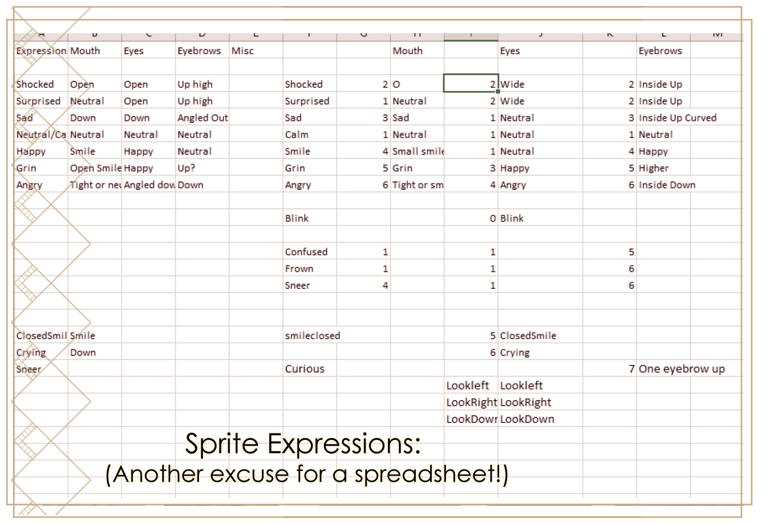
Honestly, this part was something of a surreal experience because I was just going through and making the layers for each character without really putting them all together for all possible expressions. I had to go back later and fix some of them because I started laughing uncontrollably when I saw them in the game.
Some of the odd things I left in, like Mr Thompson's amazing face when sneering, because he hasn't had to use it yet and it'll likely be a humorous moment when he does. Other things, like Celia's tendency to blink right through her own eyelids, I had to fix to prevent the whole thing from going down a body horror kind of route.
So that was about it for the first month. At the end of it I had 12 characters ready to emote all over the place and a script of around 30K words that would give them plenty of opportunity to do so, though it was off with Shar being cheerfully improved at this point. I did not, however, have any working code whatsoever, a gui appropriate to the theme, any backgrounds to put them in front of (although I'd already started preliminary work on planning these), music, or any of the six CGs I was determined to include. So, still a long way to go.
Join me next week for the last part, when I'll go over the creation of the above elements, my last-minute decision to add an extra programming feature, and how everything got put together. In addition, there were a few things to do with the actual publication of the demo (the store page! the build instructions!) that almost slipped by me entirely and never made it onto any of my many spreadsheets, so that'll be in there too.
Also, thanks so much to any of you who have taken the time to rate the demo or leave comments! I can't describe how excited I get when I see those without using some kind of expository gif, so just imagine someone toppling over with glee and there you have it. 😅
Comments
Log in with itch.io to leave a comment.
Thanks for the Update!
I really enjoyed the demo! this must have been a ton of work!
Thank you! It really was, but also oddly fun - I thought I might be exhausted afterwards, but instead I'm really looking forward to making the full game... just now with more time to do it. 😅